
Website Sizing Made Simple: When to Use PX, REM, %, and VW 📏
A quick guide to choosing the right size units in Webflow—without the confusion.

🧮 Why So Many Units?
You’re in Webflow, tweaking typography and layouts.
You suddenly notice that each sizing option has 10 different types:
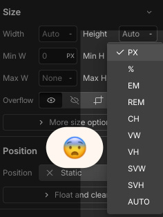
If you’re like me, you’ve felt overwhelmed
What do these options mean?
Am I using the right type here?
Do I really need all these?
(Spoiler: No. You only need 4).
Each unit changes element size differently. Choose the wrong one and your site’s look and performance will suffer.
For example, using PX instead of REM for text is a big no-no because it will screw your website's responsiveness (Using PX for text locks font sizes, making your site harder to scale for different screens and accessibility needs. REM keeps text flexible and responsive).
I did my research and found the only four sizing options I need to use in 95% of cases.
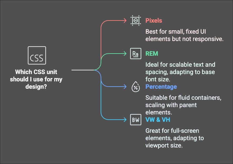
🛠 The Only 4 Units You Actually Need
1. PX (Pixels) – Fixed & Precise
This unit represents how many pixels the element will take on a screen.
👍🏽 Best for: Small UI elements (buttons, icons, borders)
🤔 Why? Doesn’t scale, always stays the same size
2. REM (Root EM) – The Scalable Standard
👍🏽 Best for: Text (headings, paragraphs), spacing (margins, padding).
🤔 Why? Scales with the website’s base font size
3. % (Percentage) – Fluid & Flexible
👍🏽 Best for: Containers, divs, grid items
🤔 Why? Scales based on the parent element
Pro Tip: 100% makes an element as wide as its parent—great for responsive layouts!
4. VW & VH (Viewport Width & Height) – Full-Screen Magic
👍🏽 Best for: Hero sections, full-screen backgrounds, fluid typography
🤔 Why? Adapts to screen size automatically
📋 Quick Cheat Sheet
🚀 Keep It Simple
You don’t need all those units Webflow offers—just stick to PX, REM, %, and VW/VH.
REM for text
% for layouts
VW/VH for fullscreen elements
PX for precise details.
Now, you can spend less time guessing and more time building awesome Webflow sites!
🔹 Want more Webflow tips? Reply and let me know what’s confusing you—I might cover it next!