


the 60/30/10 golden rule for stunning websites 🎨
learn how to combine colors easily.

Combining colors is hard.
How do you know which color goes where?
What makes a button stand out, without making your whole site feel loud?
There’s a simple design rule that helps anyone, even non-designers, get this right.
🎨 The 60/30/10 Rule
This rule is all about using three colors in a specific ratio:
60% → Dominant color (backgrounds, large areas)
30% → Secondary color (headings, sections, navwe)
10% → Accent color (buttons, links, CTAs)
This design rule works everywhere.
Here’s how it looks in interior design:
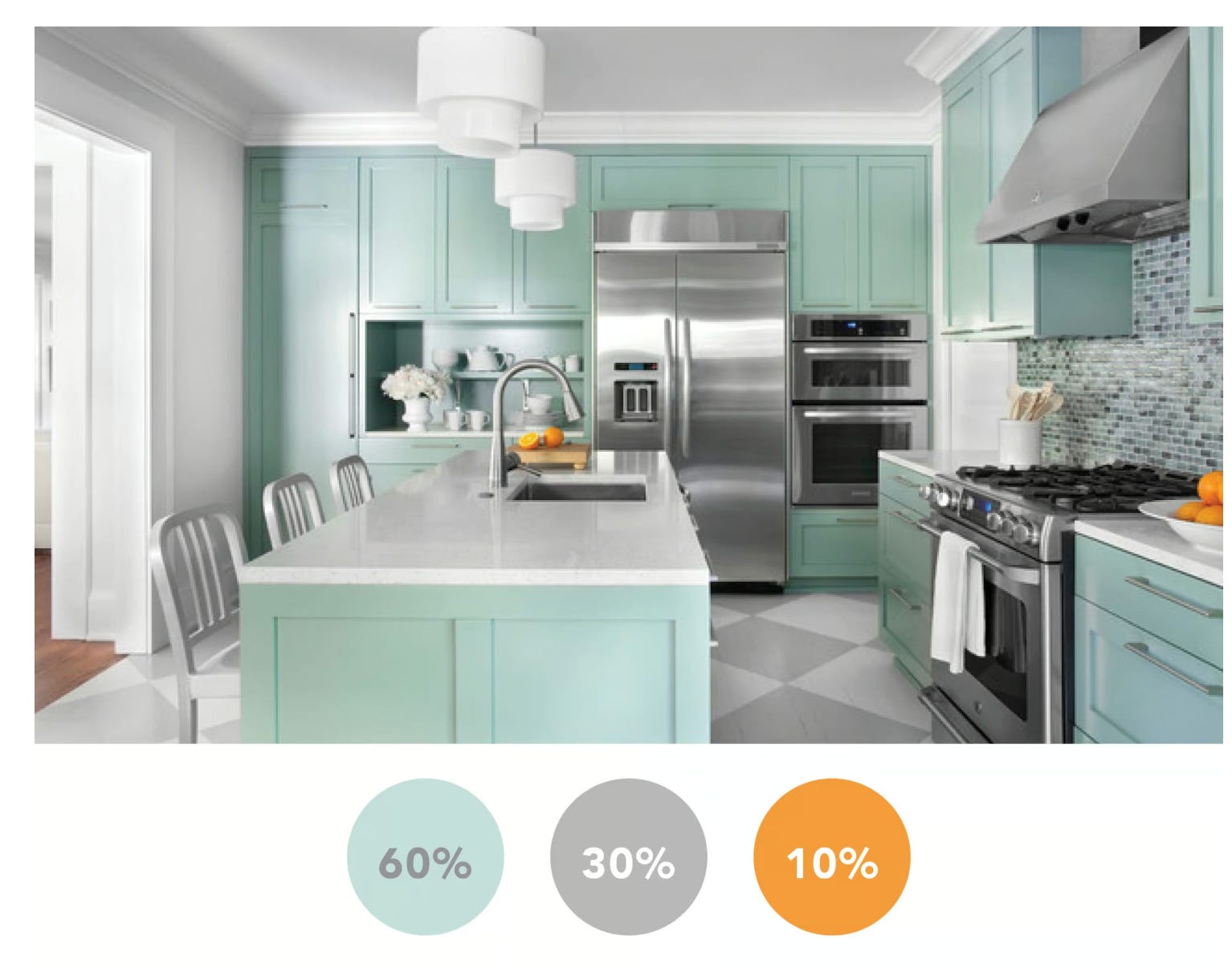
Cool, right?
It creates balance. Nothing screams. Everything just feels right.
🤷🏽 Why it works
Think of your site like getting dressed.
You wouldn’t wear five colors at once. You need to choose a few and combine them carefully.

That’s why the 60/30/10 rule works:
Limits overwhelm - 3 colors max = clean design.
Guides attention - your eye is drawn to the 10%.
Feels intentional - someone took the time to think about colors here.
🌍 Real-world website examples
Here’s a mobile product card that follows the rule perfectly:

60% light background
30% dark content
10% green CTA
That “Add to Cart” button stands out exactly like it should.
Now look at this homepage:

The background is mostly white (60%)
Black sections and typography create structure (30%)
Bright green CTAs draw your eye (10%)
This is why the design feels premium even though it’s simple.
💡 How to apply this to your site
1️⃣ Pick your palette.
Dominant = background (light gray, beige, off-white)
Secondary = structure (dark navy, deep green, charcoal)
Accent = CTA (lime, red, orange, purple, whatever pops)
You can use a site like Coolors to find a good palette.
2️⃣ Apply the 60/30/10 rule to your page.
60% → Dominant color (backgrounds, large areas)
30% → Secondary color (headings, sections, navwe)
10% → Accent color (buttons, links, CTAs)
Bonus: master the rule before breaking it
You’ll see a lot of great websites that break this rule.
But remember: to become a great artist, first follow the rules, then learn how to bend them.
It’s only when you've mastered the basics that you’ll find ways to break the rules and still make incredible designs.
But if you want a clean, conversion-friendly site that doesn’t scream “amateur,” start here.