
quickguide for choosing fonts (basics, tips, tools and process)
Learn the basics and get my simple process for choosing fonts.

Fonts are one of the core building blocks of a website.
But it’s a confusing world.
There are tons of fonts and I don’t want to spend a lot of time choosing the right one.
Knowing the basics and having a simple process is all you need to pick the right font.
4 types of fonts
Serif, Sans-Serif, Monospace, Display and Script.

Serif – Fonts with small “feet” or strokes at the ends of letters. These give traditional and formal vibes.
Sans-Serif – Clean fonts without extra strokes. It is ideal for modern, minimalist designs and is optimized for screens.
Script/handwriting – More artistic styles are good for special cases.
Display/Decorative – Unique and eye-catching fonts designed for headlines, not body text.
Monospace - Technical font where all characters have the same width.
how to optimize typography
Line Height: The vertical space between lines of text.
Aim for 1.5x the font size for comfortable reading.Font Weight: Refers to how bold or light a font is (e.g., 400 = Regular, 700 = Bold).
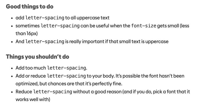
Use heavier weights for headings and lighter ones for body text.Letter Spacing: The space between letters. The bigger the text, the less space is needed.

Letter Spacing best practices (credit: kevinpowell.co)
3 golden rules for picking website fonts
Readability is top priority: No matter how beautiful a font looks, it needs to be easy to read. Sans-Serif fonts are often best for this.
Align Fonts with Brand Personality: Is your brand modern, playful, elegant, or corporate?
And the most important rule:
Stick to 1–2 Fonts: Keep it simple. One font for headings and one for body text is usually enough.
quick process for picking the perfect font
1. Define Your Brand’s Personality:
Modern? Choose a clean Sans-Serif.
Classic or elegant? Opt for a Serif.
Fun and playful? A bold Display font could work.
2. Start with the Body Font:
Go to Google Fonts and pick a font that looks good to you.
If you don’t know where to start, stick to web-optimized fonts like Inter, Roboto, or Open Sans.
3. Choose a Heading Font That Stands Out:
Now find something bolder or more stylized to contrast your body font.
4. Test Fonts in Real Context
Apply them in your website layout.
Check how they look in headlines, buttons, and body text.
Adjust line height, font size, and spacing for balance and clarity.
5. Check Accessibility & Responsiveness:
Ensure the text is readable on all devices and meets accessibility standards (contrast ratios, font sizes).
6. Finalize & Stay Consistent:
Once you’ve made your picks, define clear typography styles (for headings, subheadings, body text) and use them consistently.
best tools for choosing fonts
🎨 Google Fonts – Huge library of web-safe fonts with pairing suggestions.
🔍 WhatFont – Identify fonts on any website to build your inspiration board.
📏 Type Scale – Helps create a consistent font size hierarchy.
📂 Fonts In Use – See real-world examples of fonts in action across industries.
Mastering fonts shouldn’t be hard.
Learn the basics
Choose 1-2 fonts for each website.
Use tools and build an inspiration board.