
how to design the perfect navbar (simple forumla) 🧭
Improve your navbar fast with this checlist.

your navbar matters
The navbar is the first thing users interact with.
🟢 Great navbar makes navigation easy and moves users toward action.
🔴 Bad navbar = confusion, high bounce rates, and lost conversions.
I wrote this article as a cheat sheet for myself when designing and auditing websites.
I’m sharing it with you so you can build better navbars, fast.
🟢 the perfect navbar formula (best practices)
I read everything I could on building navbars so you don’t have to.
These tips help me create the perfect navbar every time.
Keep it simple – 3-6 essential links. No clutter. Use dropdown only if necessary (and make sure they open on hover).
Sticky navbars are better - Basic: keep it visible at all times. Advance: Hide on scroll down, show on scroll up for a cleaner experience.

Hide on scroll down, show on scroll up CTA that stands out – One clear action. Highlighted and visible. Text moving users to action (“Start now FREE”).
Optimize for mobile.
Clear language - avoid generic labels like “Solutions”. Make it specific.
Logical order – Most important links go first (left to right, top to bottom).

🔴 common navbar mistakes (what not to do)
Avoid the extra click! Many websites require you to click to see the navbar. It’s bad UX and not needed on desktop.
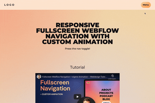
Extra click to see the navigation ❌ Don’t cover the screen - look at the gif above. Why do we need to hide everything to show the menu?
Don’t get fancy - keep things familiar. Use a hamburger icon. Don’t reinvent navigation just to be “unique.
Don’t use social icons - your navbar should guide users deeper into your site, not send them away. Social links belong in the footer.

audit your navbar right now! 🔍
Use this checklist and improve your navbar now.
Remove one unnecessary link
Clarify one link
Make the navbar sticky
Test it on mobile
Fix these, and your navbar will guide users instead of confusing them.
Want me to review your navbar? Reply and send your site! 💻